Conserve
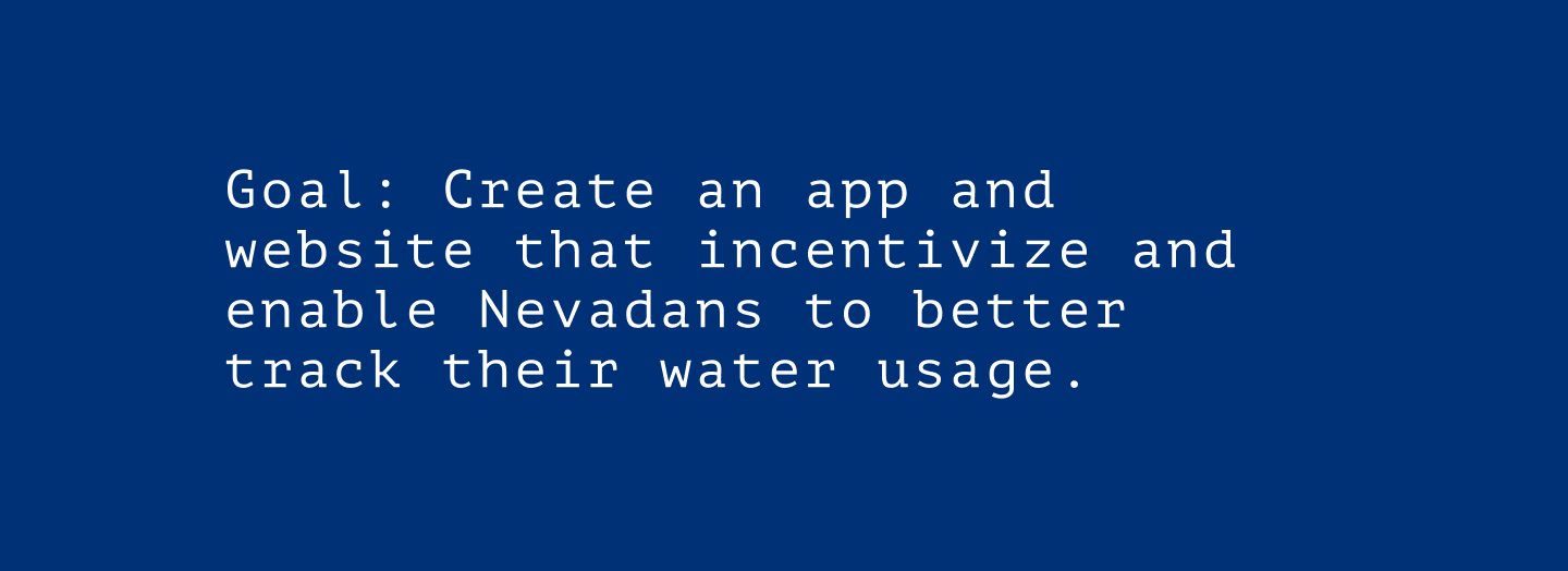
Conserve is an app to help residents of Nevada monitor and evaluate their water usage, to achieve a more sustainable and water-smart lifestyle.


There were a handful of challenges which presented themselves as I worked to solve the design problem. For example, there was not an existing service that I could identify that provided the same features that Conserve aims to offer to its user base. As a result, there was limited data available from a small number of indirect competitors.
Some of the constraints which would affect the project outcome include the varying use cases in which the product would be utilized. As a result, the mobile application would present itself more as a utility while the desktop site served more as a knowledge base. Similarly, the user flow and information architecture needed to be reevaluated for these different instances to better serve the diverse population who would engage with Conserve in myriad ways.

Using Quantitative research methods, I learned that most of the water used in new homes comes from indoor use, such as showering and preparing food. This water, however, is part of a closed system meaning that almost all of it is treated and returned to the reservoir. This means that it is going to be especially important to educate users on how to responsibly use water outdoors.
This actually challenged my assumptions and allowed me to reduce some bias in designing the mobile app and responsive website for Conserve.
Using the Crazy 8s ideation technique to generate ideas.

Some of thse concepts were then translated to screens via paper wireframing:


These were then digitalized to create what would become a low-fidelity prototype:

After the high fidelity protoype was built, an unmoderated, remote usabilty study was conducted with 5 participants. The results of the study and the participants comments were recorded and sorted using an affinity diagram, as shown:


The full prototype can be viewed HERE
